FALL studio 18’
pOETICS OF MOVEMENT
Project Brief
This particular project was set in Over the Rhine and with the goal of familiarizing students with standard architectural drawings such as plans, elevations and sections, while encouraging them to address site and context when designing for communities.
In terms of the design itself, students were required to create a new library that would cohesively play with the existing area, while also being distinguished enough to draw in users. This library was to be multifunctional, with additional features to serve multiple users, similarly to the Poetry Foundation in Chicago, our encouraged precedent.
site
In terms of site, the building area fell in the empty lot between Race and West 13th Street. As you can see, the given site is directly opposite of one of the most attractive areas in all of Downtown — Washington Park. The attractiveness of the park influenced many design decisions discussed later, with the view becoming one of the most important qualities to address when it came to structure.
One of the most important aspects of the area was the buildings next door. The goal was to not compete with the existing architecture, but instead design something that would work in harmony.
CONSTRUCTION DRAWINGS

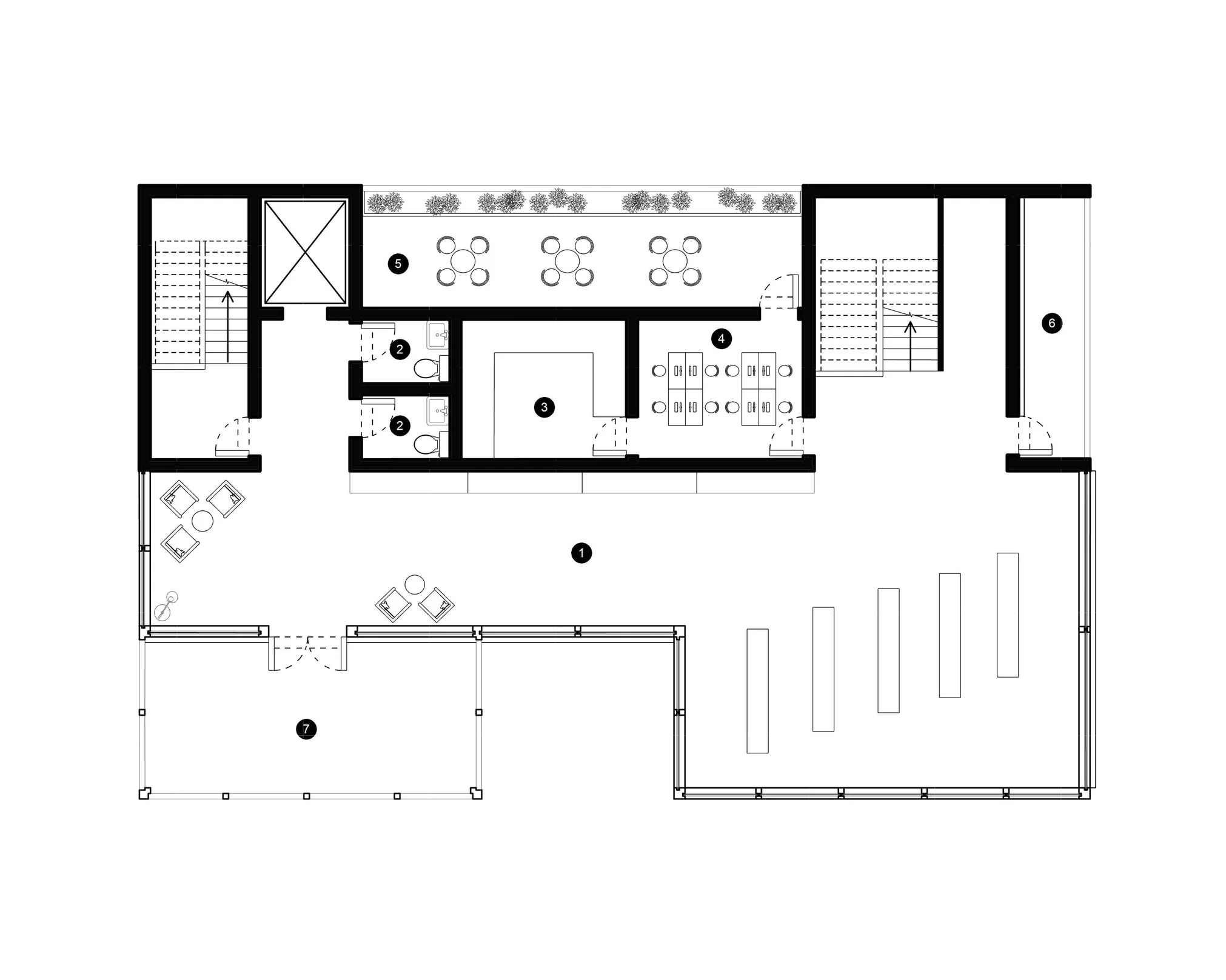
FIRST FLOOR PLAN
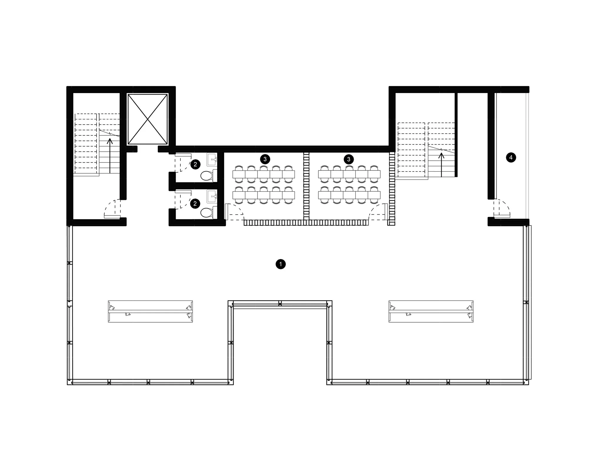
SECOND FLOOR
THIRD FLOOR

FOURTH FLOOR
The biggest challenge that arose during this project was creating the plans themselves. Not only did I have to address the site, but also the surrounding structures. The goal was to design a structure that would not overwhelm the other buildings around it, but also maintain enough originality to make it stand alone.
After many iterations, I finalized my design down to a simple formation. Two extrusions on the west create a void for visitors to enter and feel like they are becoming immersed in the space. Meanwhile, an extrusion from the north encourages movement out. The two elements maintain a flow of in and out, creating a fluid atmosphere. The intention was to define a circulation pattern before determining the placement of specific rooms.
In terms of placement, I sought to create a symmetrical format so the space would become intuitive to the user. Instead of searching for specific spaces on each floor, they would recognize the pattern and be able to maneuver with ease.
LONGITUDINAL SECTION

elevation | north
TRANSVERSE SECTION
Transverse & Longitudinal Sections
Both the transverse and longitudinal sections offer a different kind of glimpse into the space that the plans do not offer. The sections highlight how all the horizontal and vertical elements come together. The structure follows a symmetrical layout, with most rooms following a common grid.
The grid system aided in making the space more intuitive to the user. Instead of having to guess where specific rooms and details were on each floor, the user would already have an idea based on the spaces they had already interacted with.
The longitudinal section also highlights the change in elevation that the auditorium features in order to reach a respectable amount of seating. Such a change was required in order to maximize space to the fullest.

elevation | west